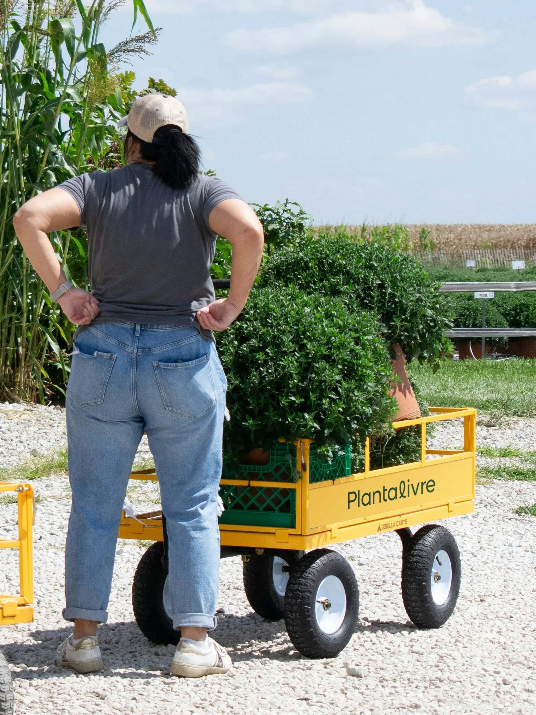
PLANTALIVRE
PORTUGAL / 2026
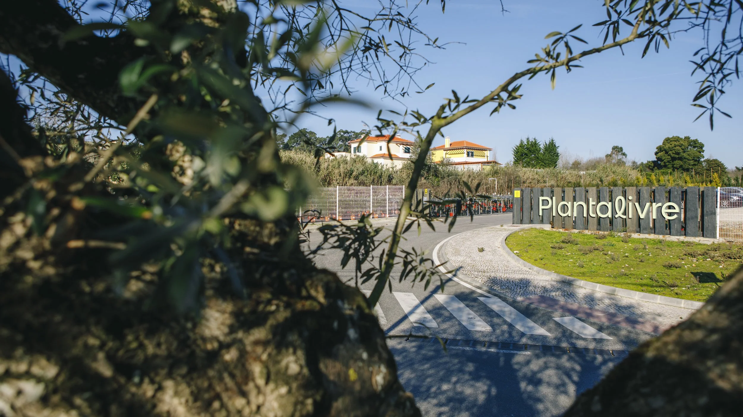
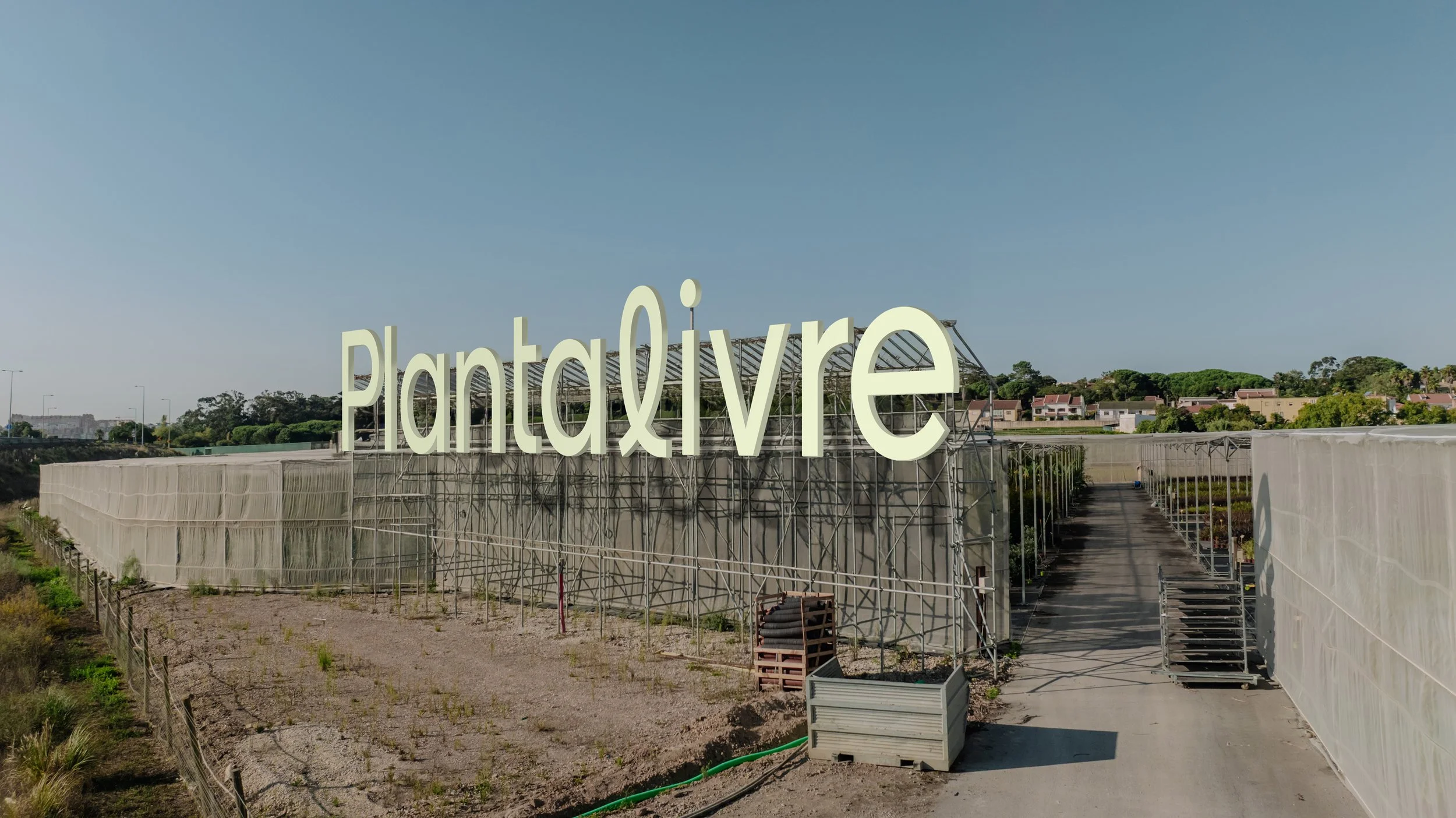
A Planta Livre é o maior viveiro de plantas do país, com instalações em Sintra, especializada em plantas ornamentais, e em Cabeceiras de Basto, especializada em árvores de maior porte.
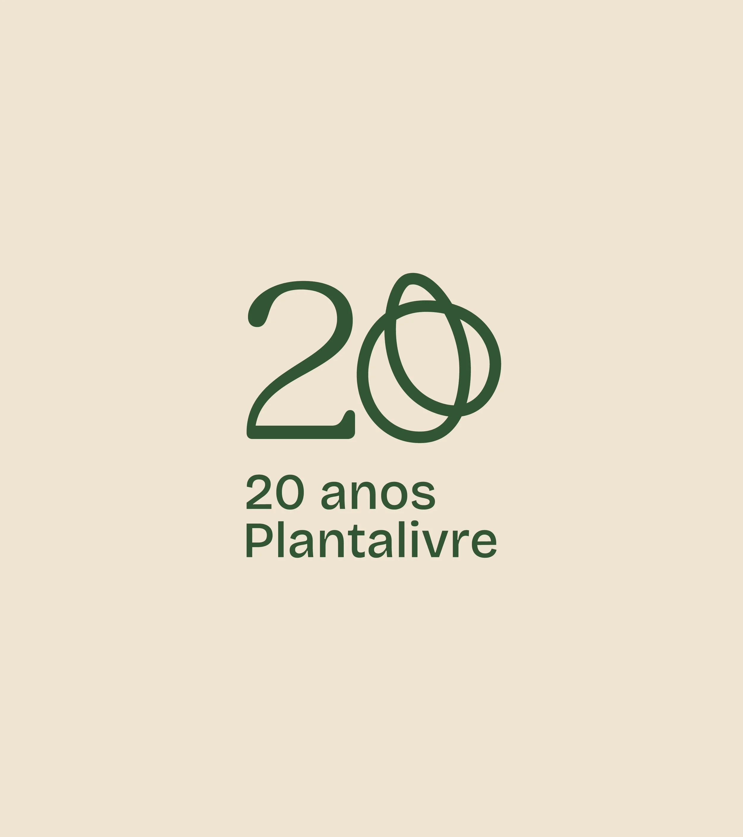
A celebrar 20 anos de existência, a alargar o público, até aqui profissional, para o consumidor final, e a apostar nos meios digitais, a marca necessitava de ser atualizada para responder a uma nova realidade multi-target e multi-meios.
O pedido foi a atualização do logótipo, resolvendo alguns problemas técnicos na tipografia e ajustando a paleta cromática para tonalidades mais claras. Mas algures durante as conversas com o cliente, sentimos que havia abertura para ir mais longe.
Planta Livre is the largest plant nursery in the country, with facilities in Sintra specializing in ornamental plants and in Cabeceiras de Basto for larger trees.
Celebrating 20 years in business, expanding its audience from professionals to end consumers, and investing in digital channels, the brand needed to be updated to meet a new multi-target, multi-channel reality.
The brief was to update the logo, address technical issues with the typography, and adjust the color palette to lighter tones. But somewhere during our conversations with the client, we sensed openness to going further.
Old brand
CONTEXTO / CONTEXT
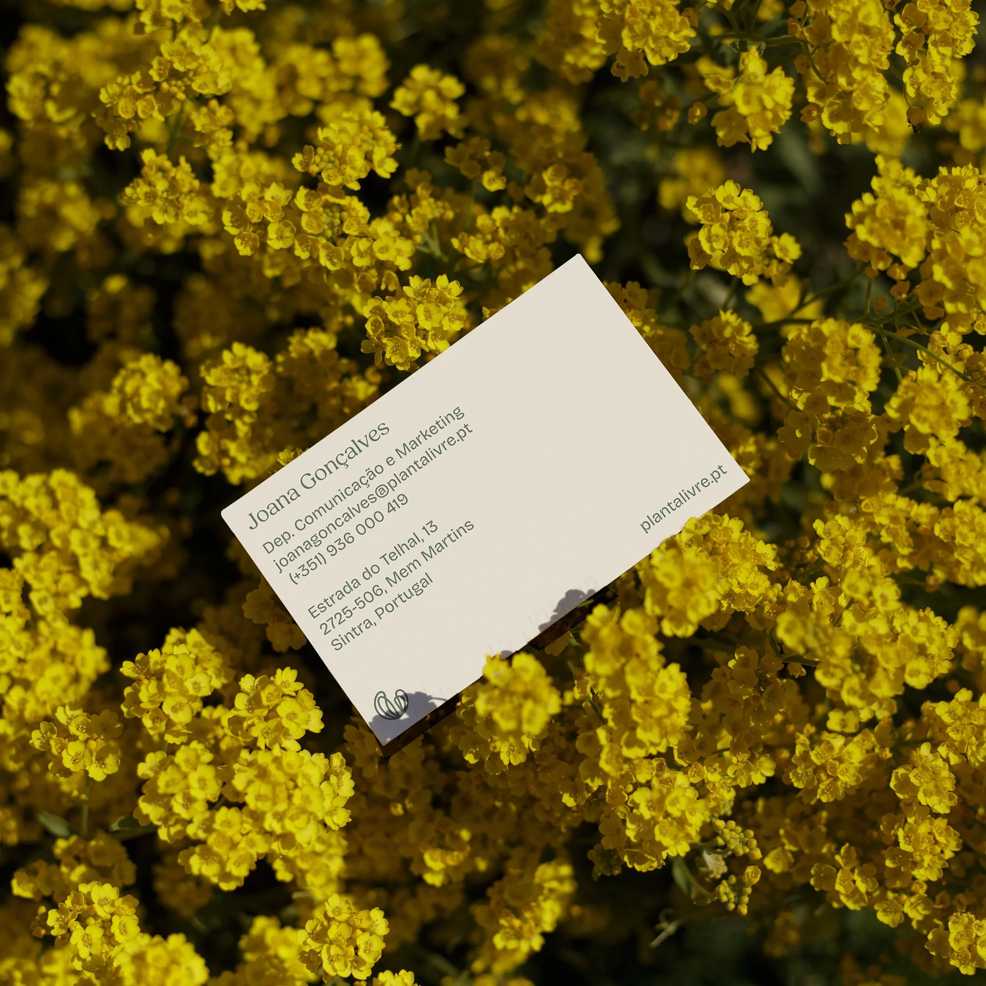
O nome Planta Livre nasce de uma particularidade distintiva da empresa: ali, as plantas fazem parte do seu crescimento ao ar livre (e não exclusivamente em estufa), o que as torna particularmente resistentes e com taxas de sobrevivência no destino final acima da média.
O logótipo anterior procurava uma representação mais literal do nome, juntando ao referente de uma planta, a silhueta de um pássaro em voo, como sinónimo de liberdade.
Devido à falta de um sistema de identidade mais abrangente, a marca ficava demasiado dependente da repetição do logótipo, pouco flexível e adaptável às novas necessidades de objectivos da empresa.
The name Planta Livre stems from a distinctive characteristic of the company: plants grow outdoors (rather than exclusively in greenhouses), making them particularly resilient and achieving above-average survival rates at their final destination.
The previous logo sought a more literal representation of the name, combining a plant reference with the silhouette of a bird in flight, as a symbol of freedom.
Due to the lack of a broader identity system, the brand became overly reliant on logo repetition, with little flexibility to adapt to the company’s new goals and needs.
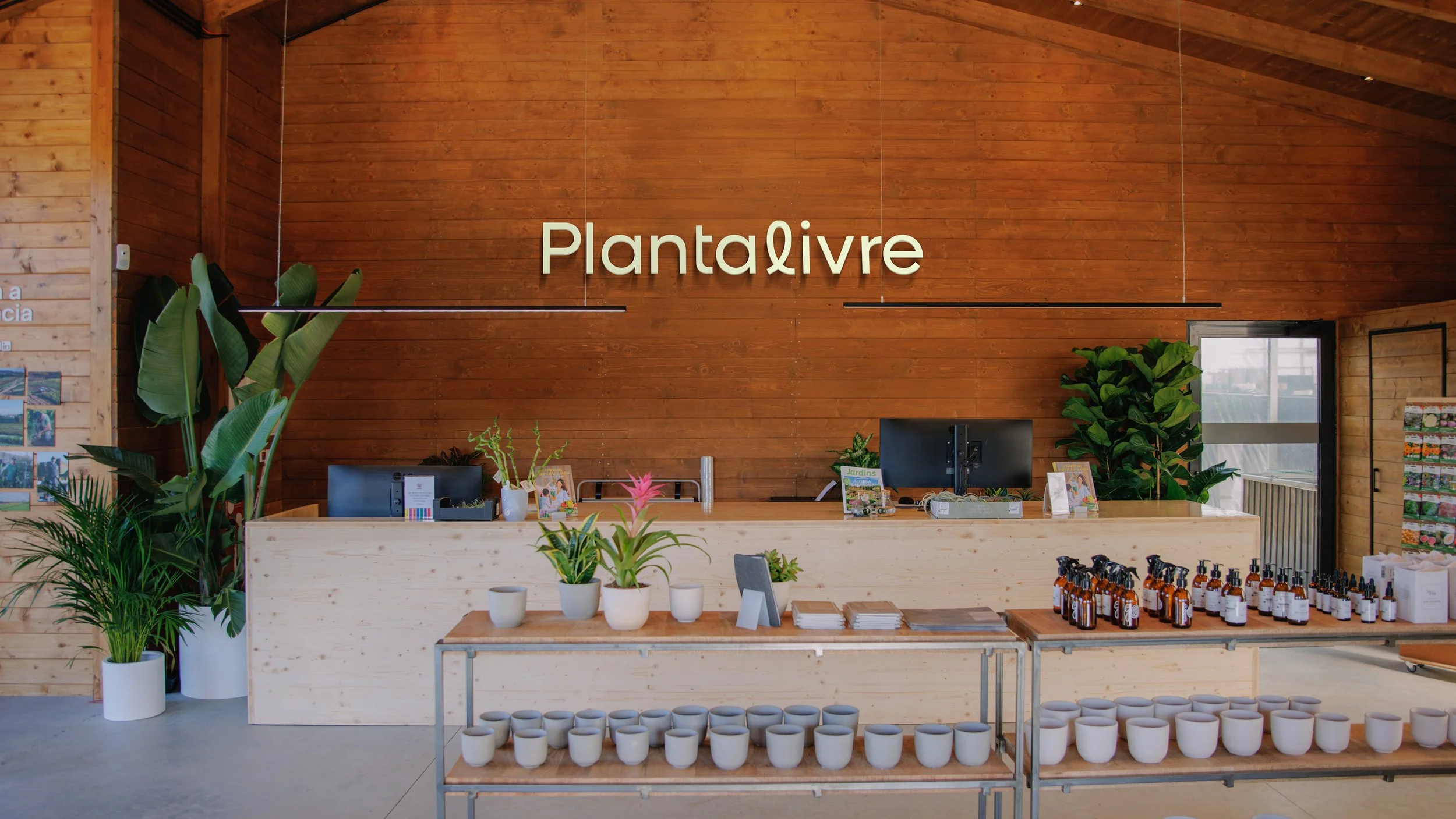
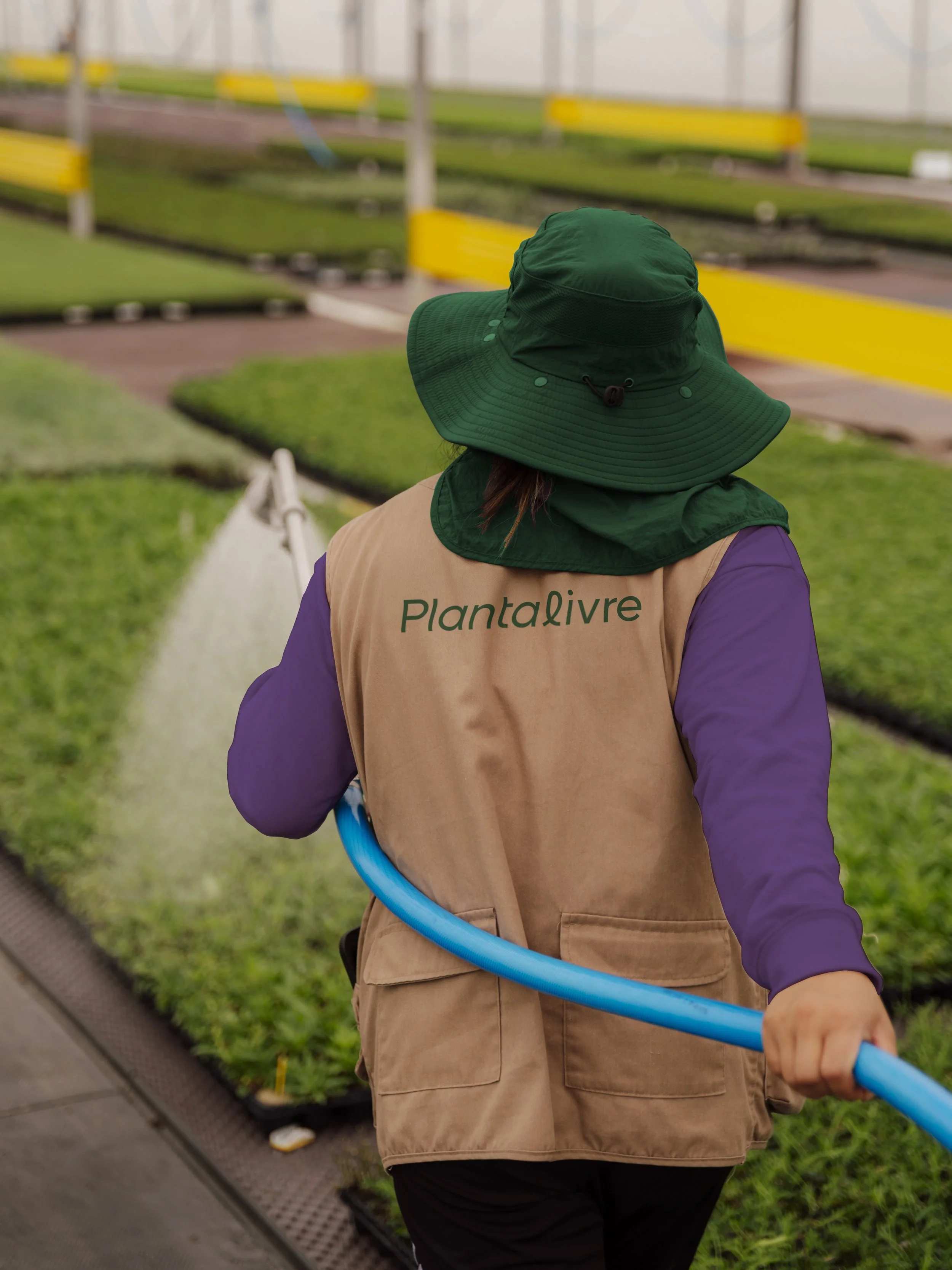
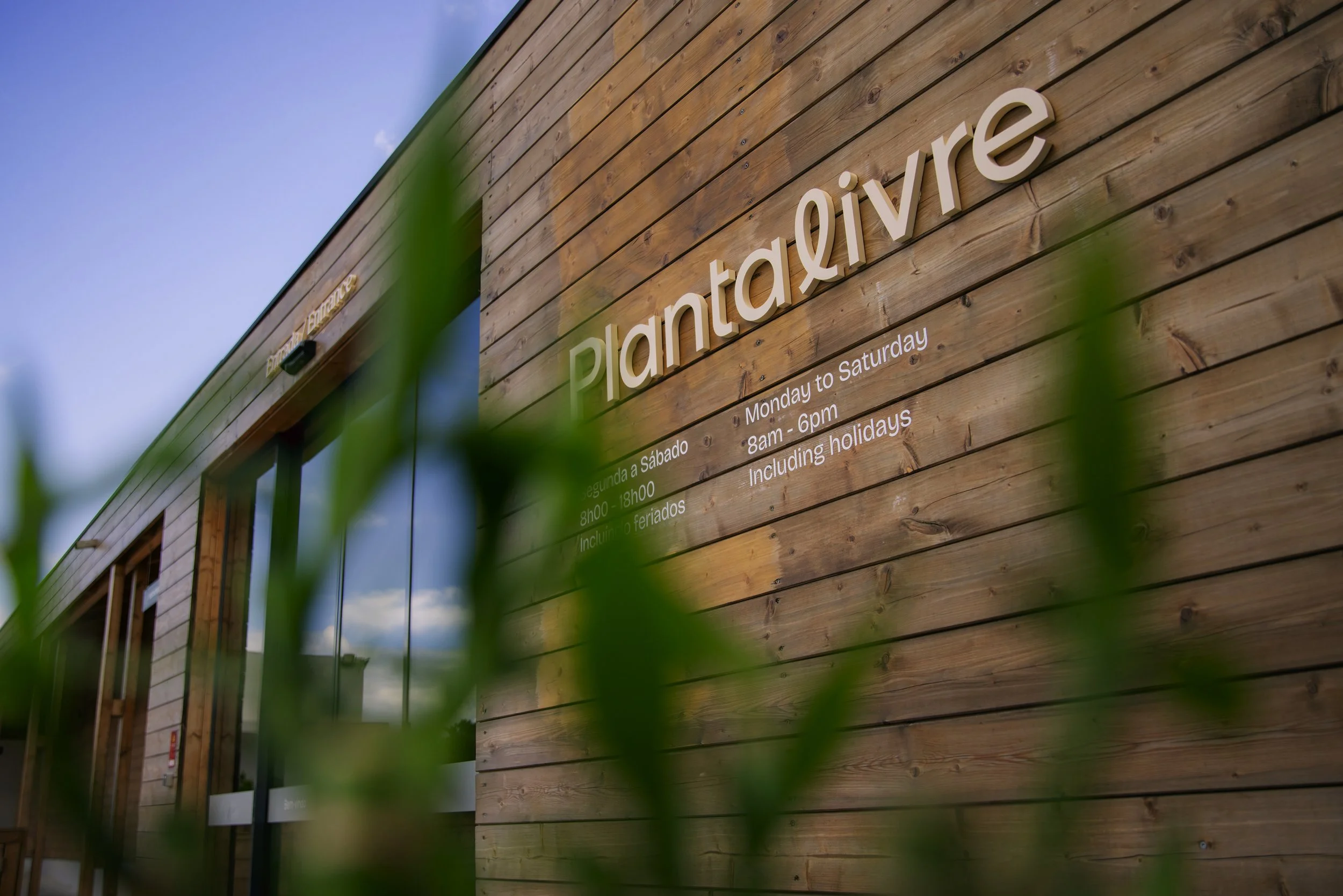
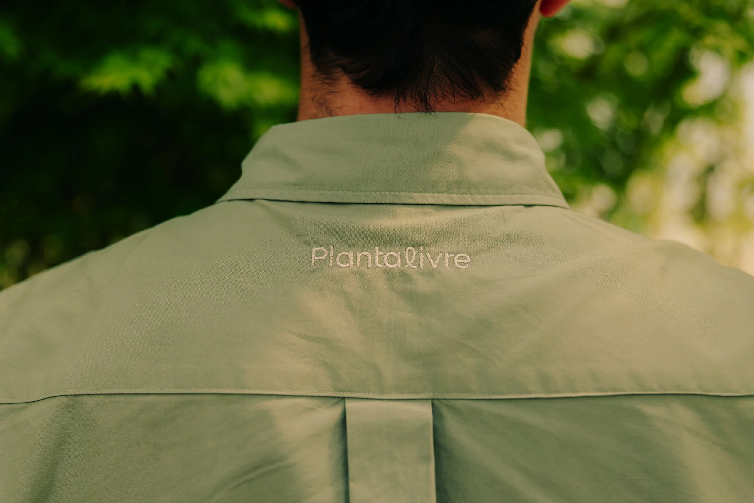
A NOVA MARCA / THE NEW BRAND
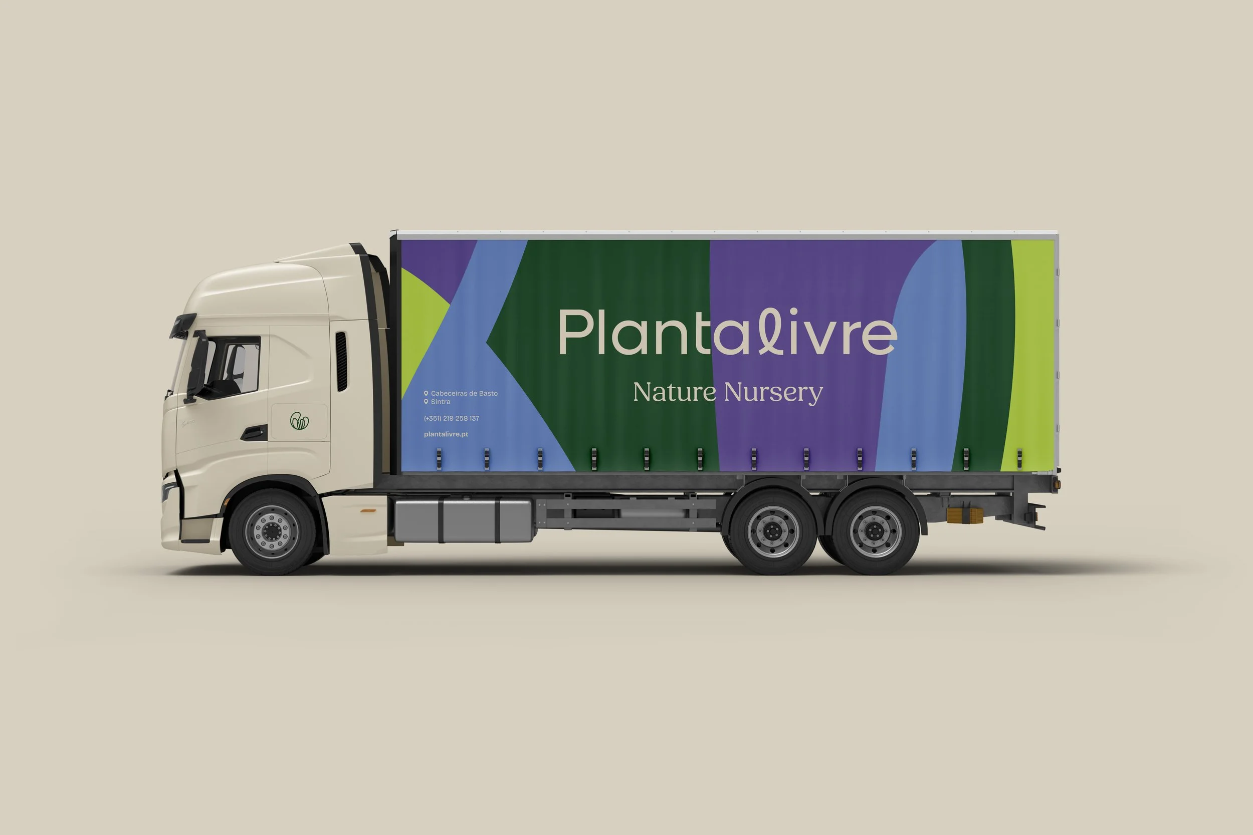
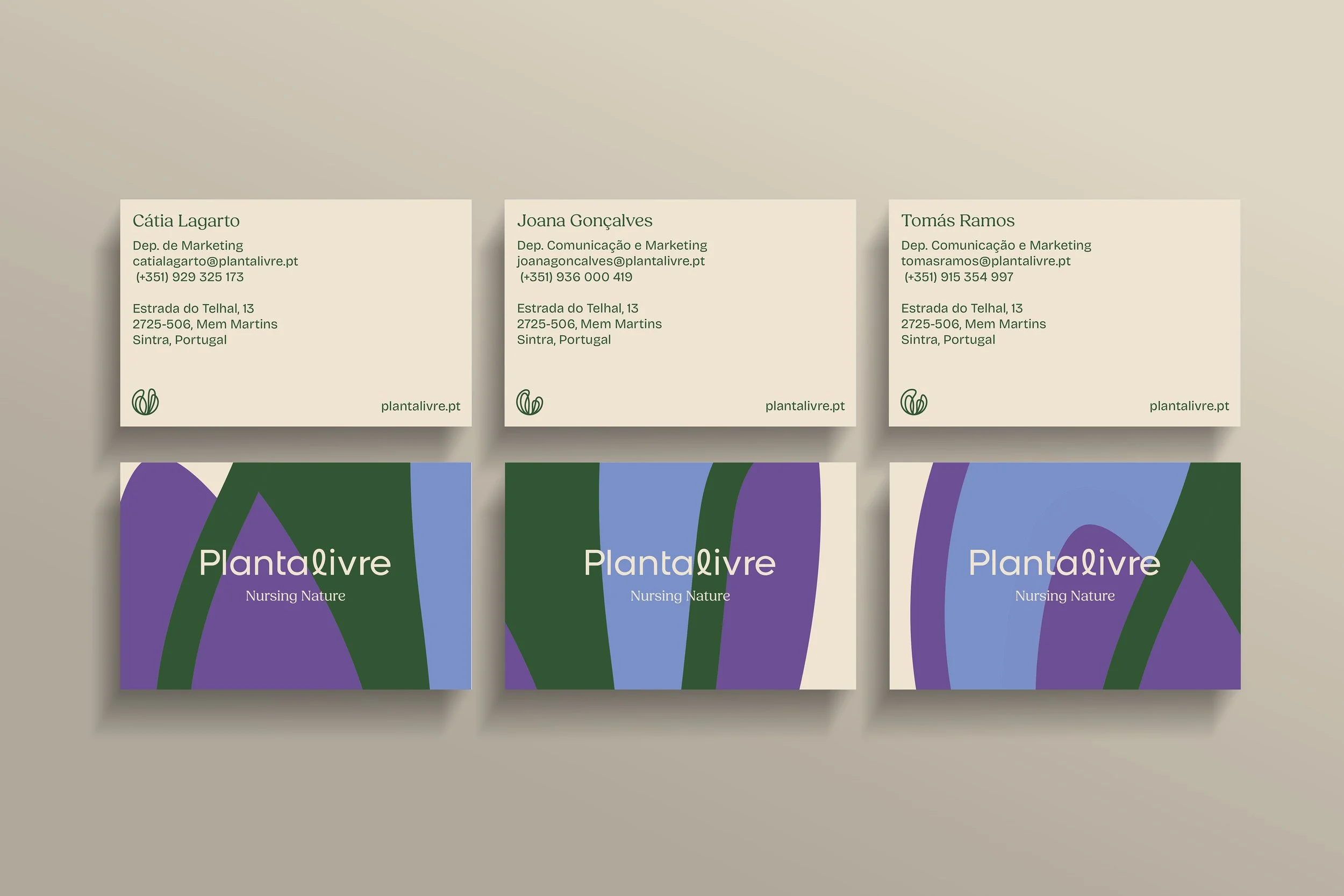
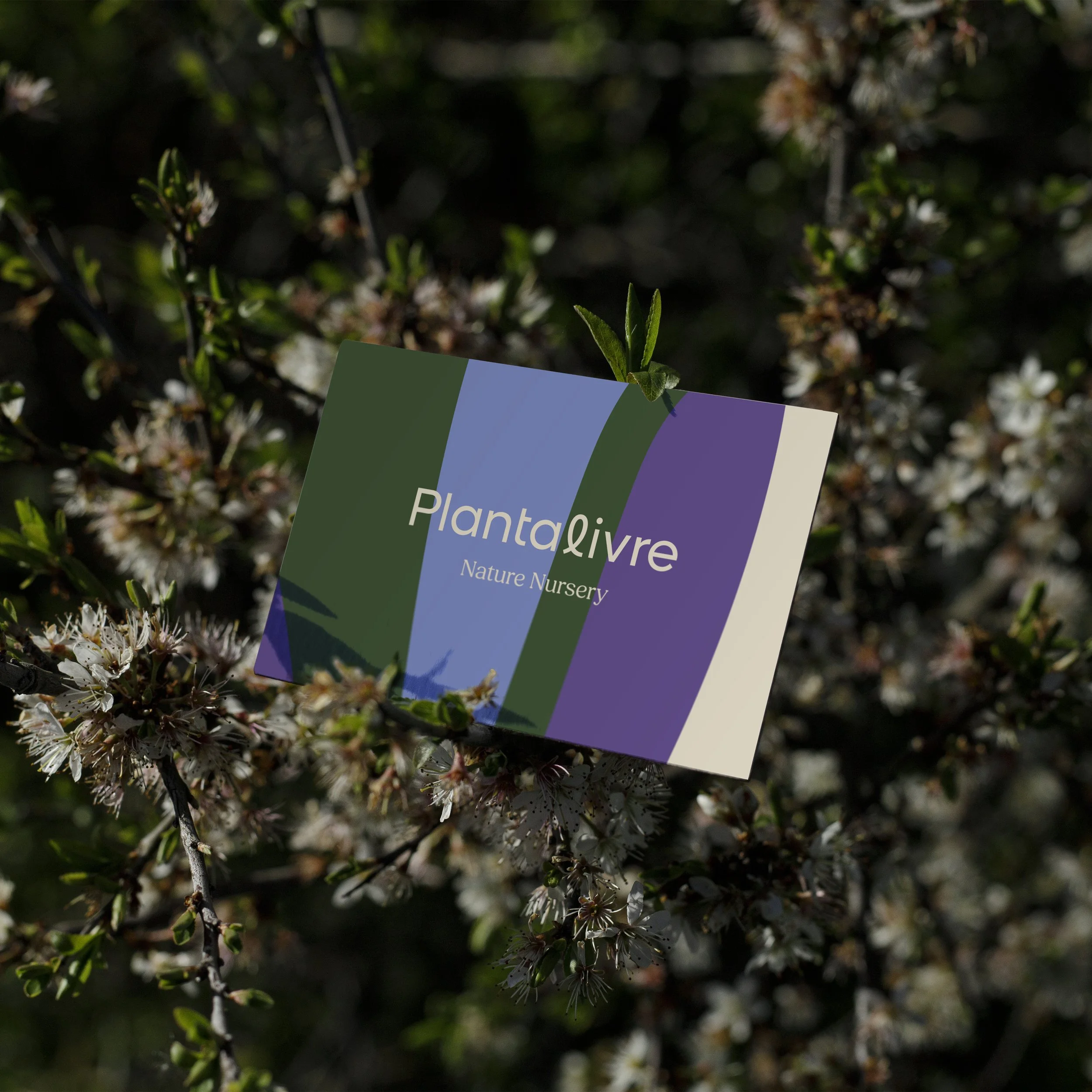
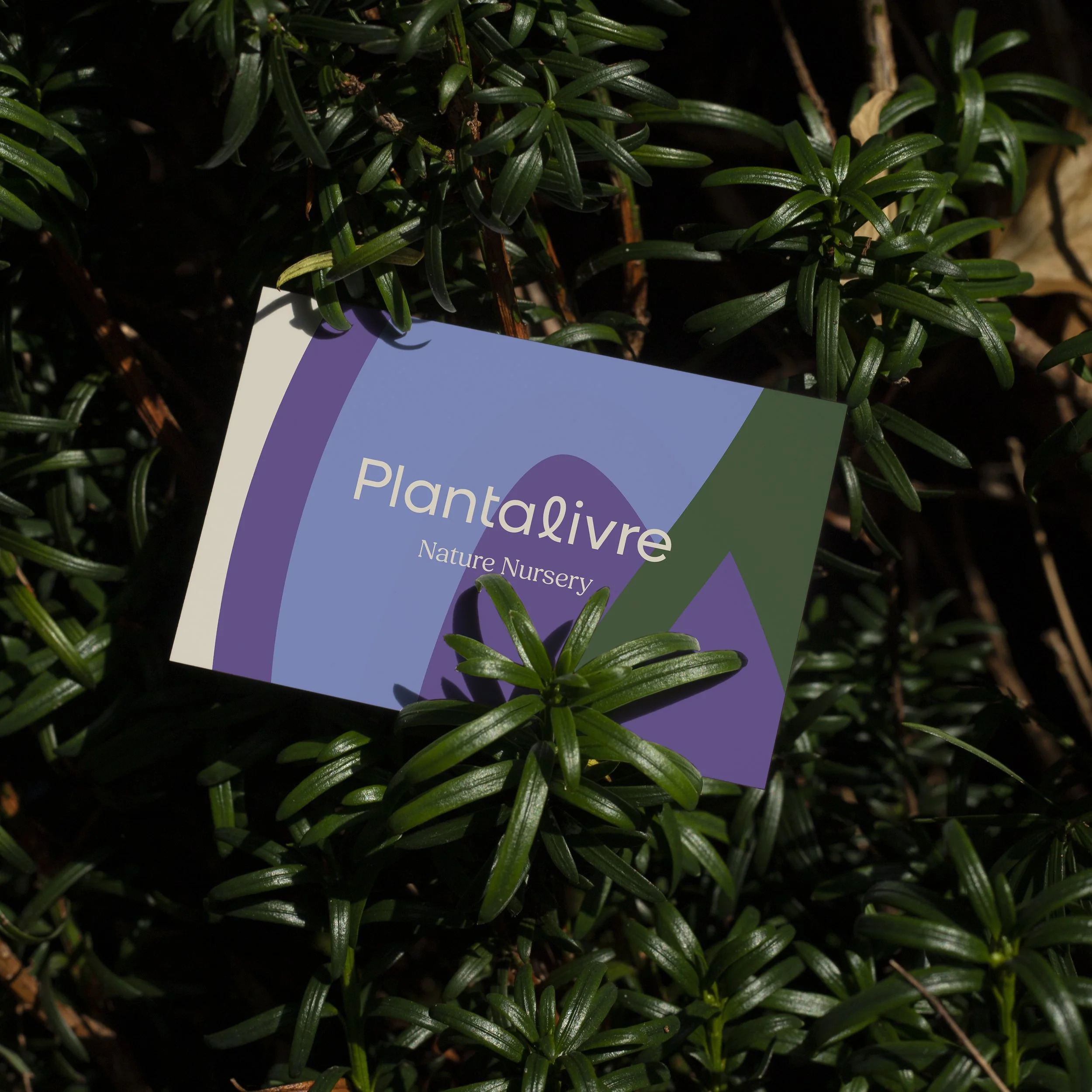
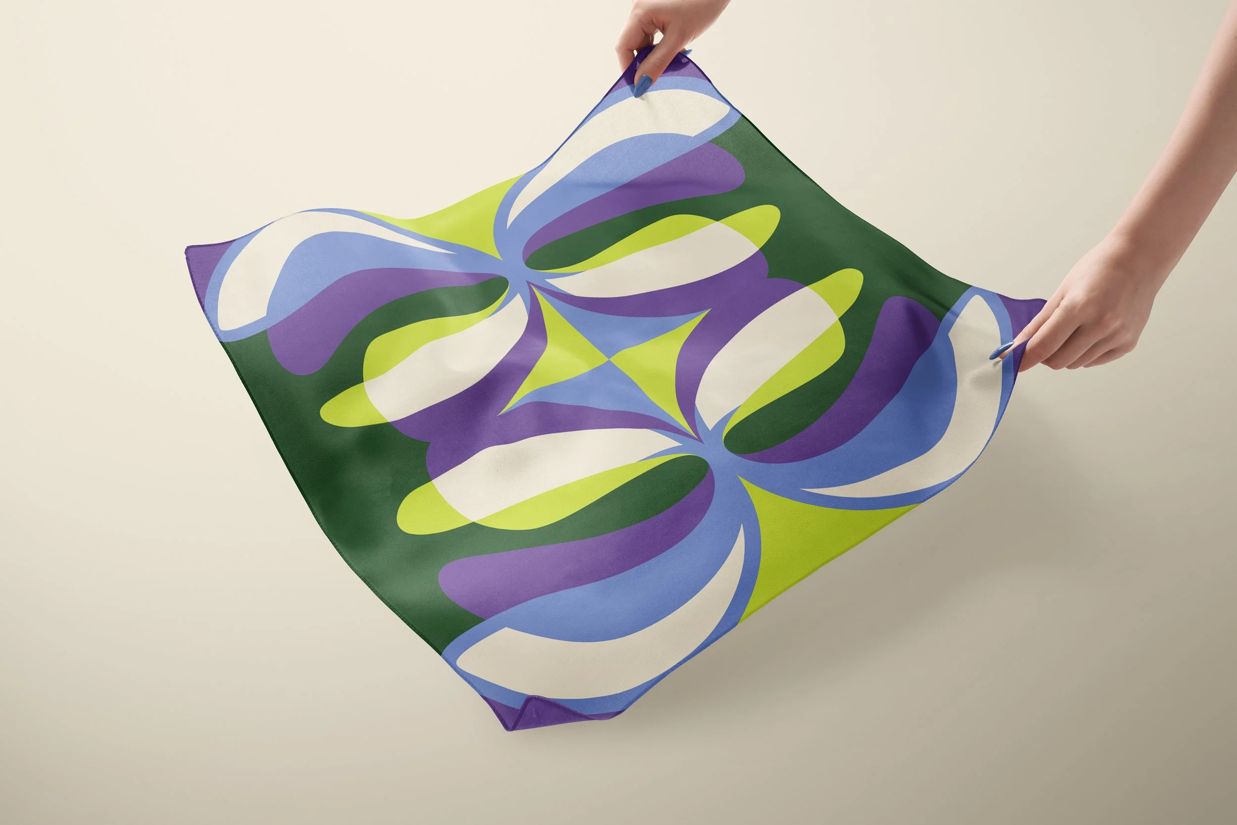
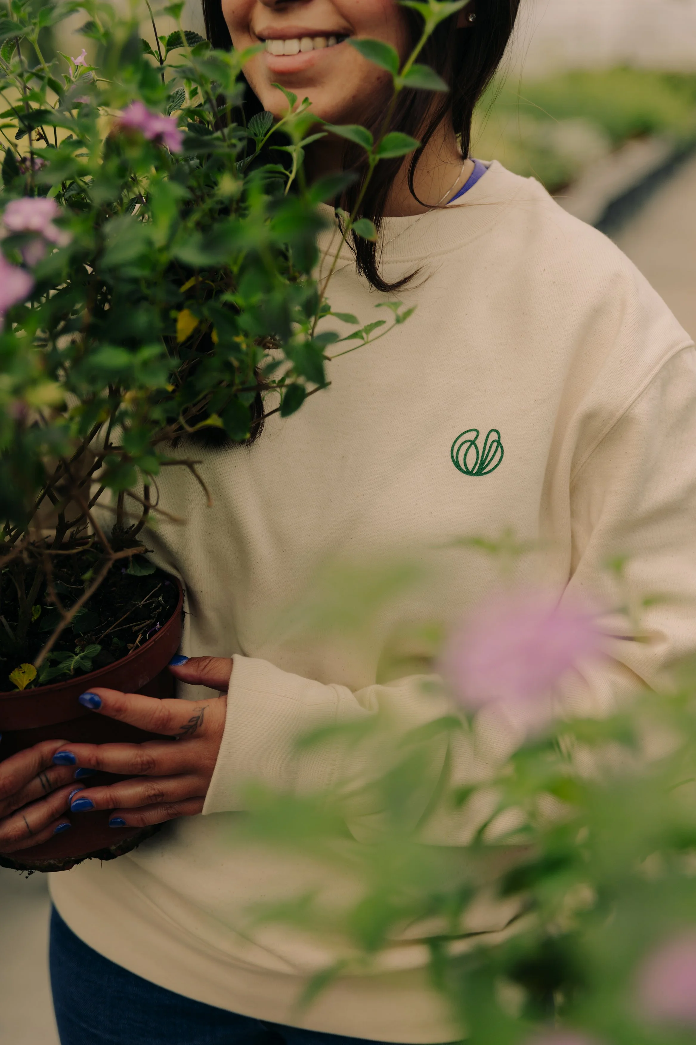
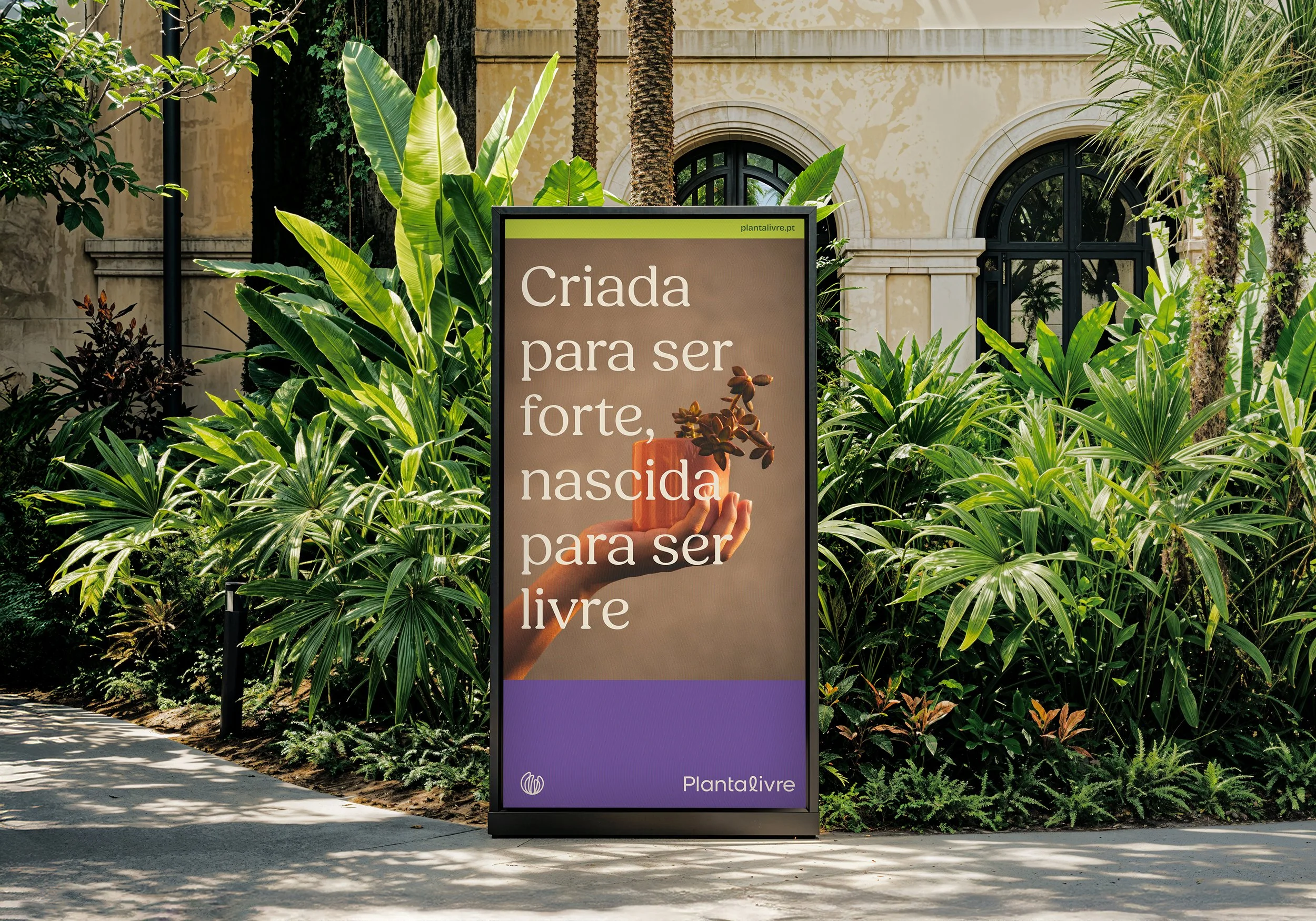
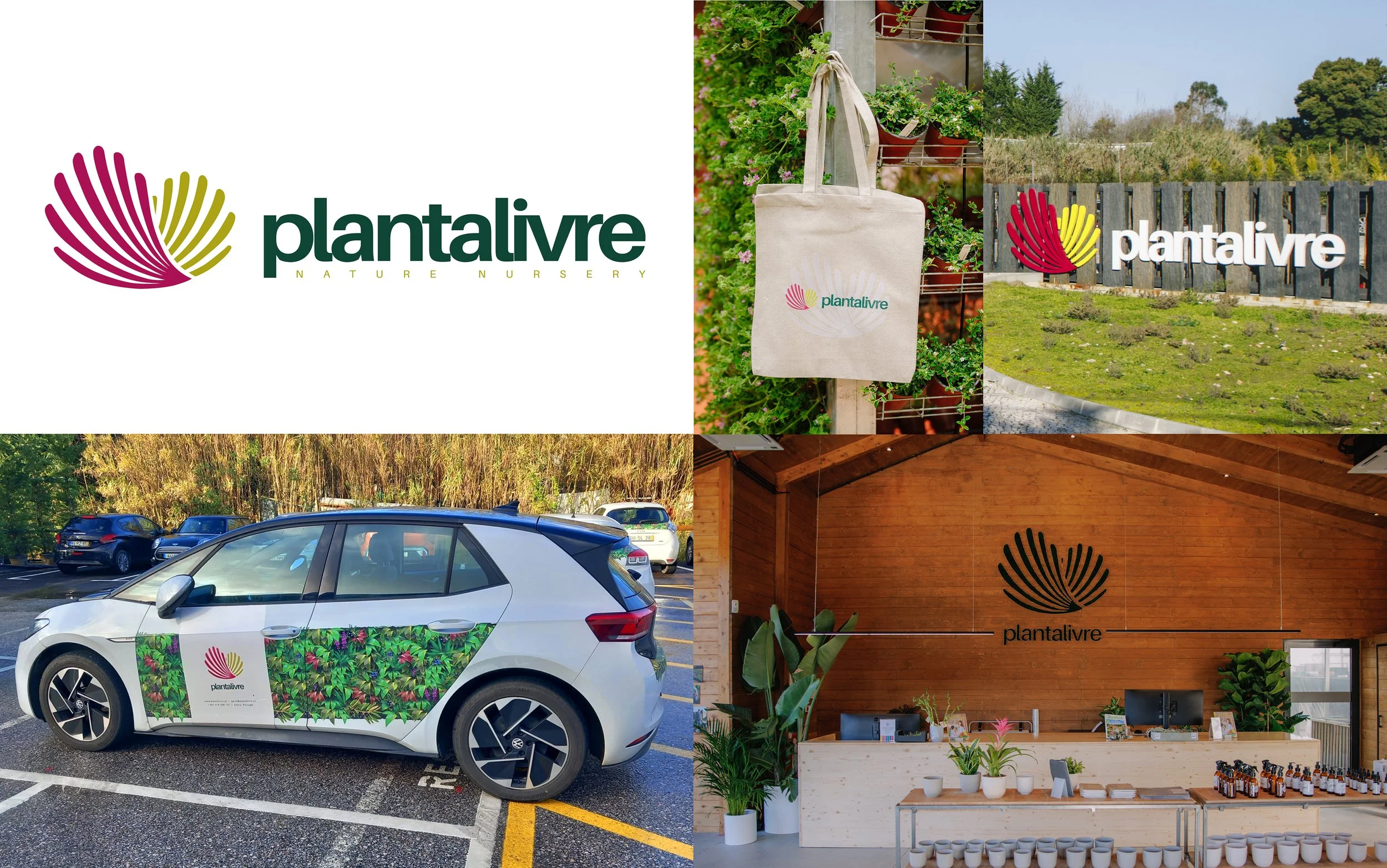
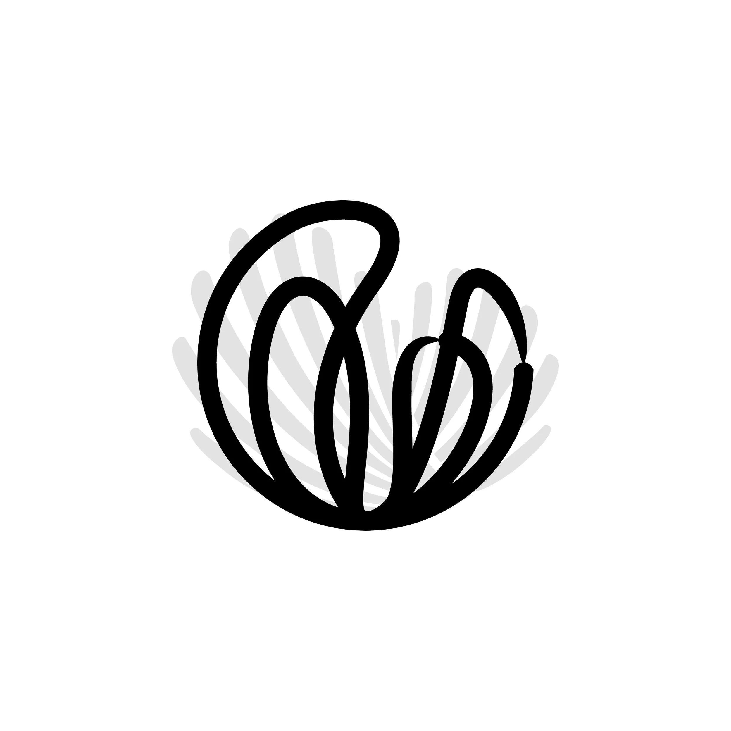
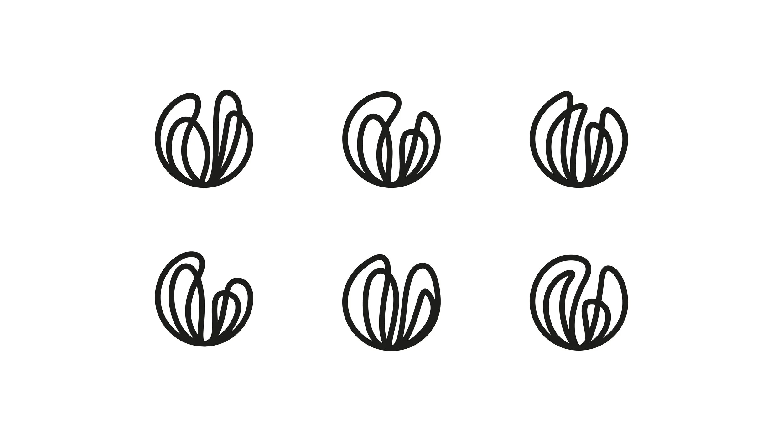
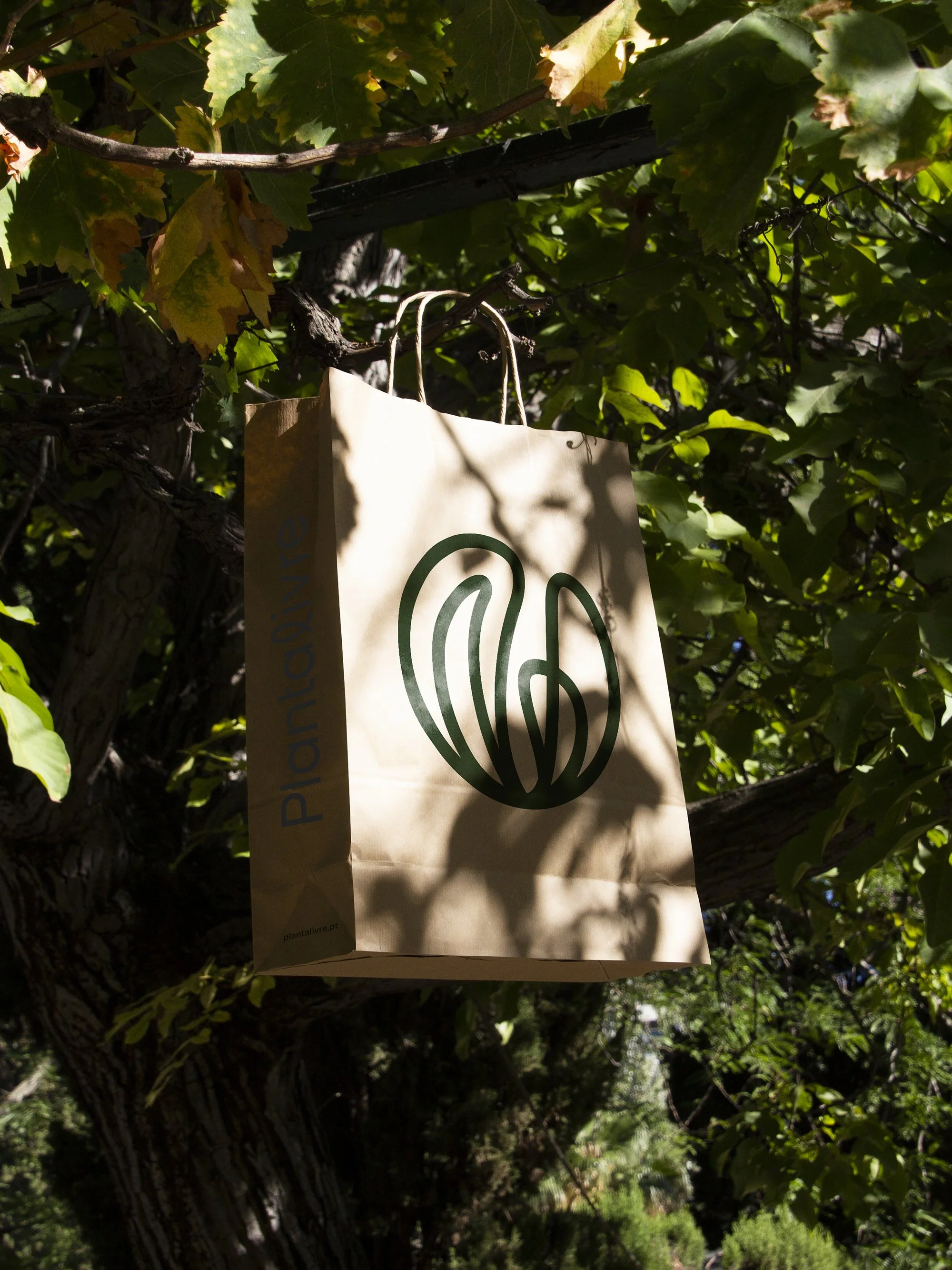
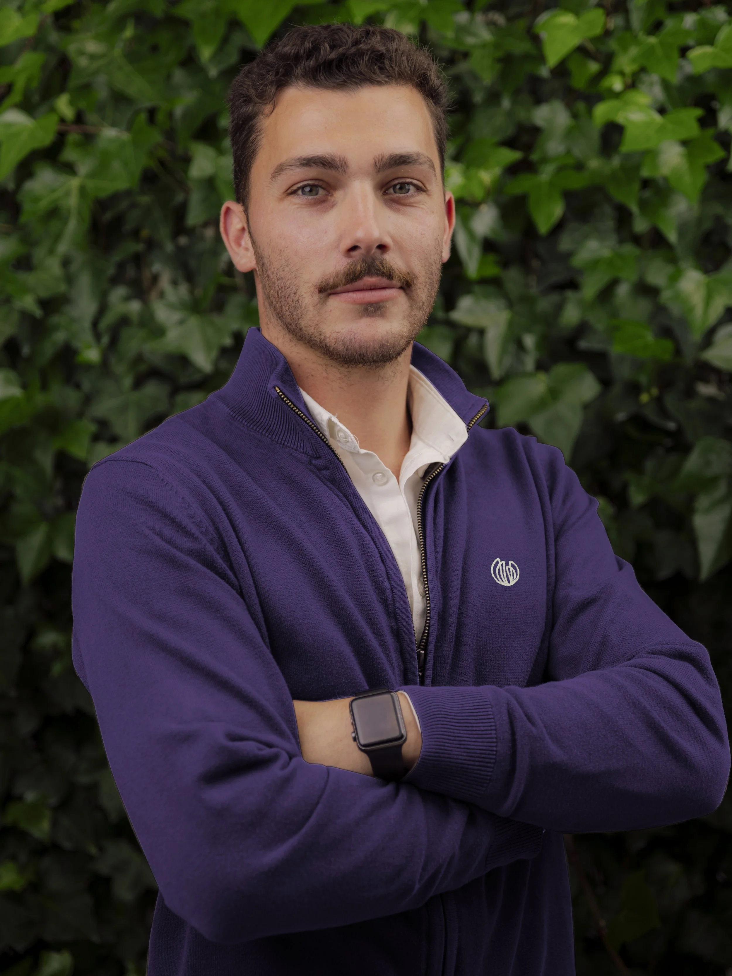
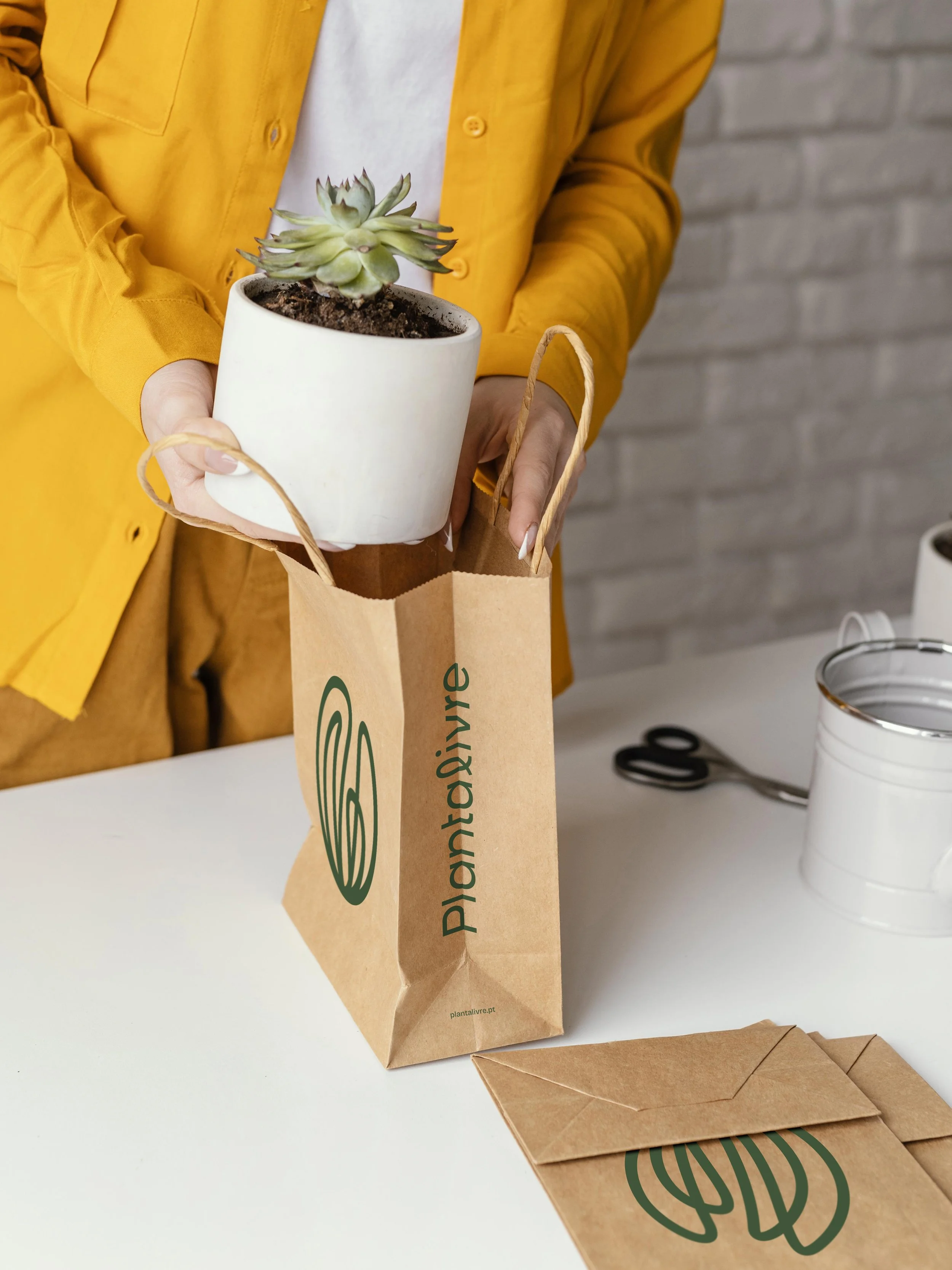
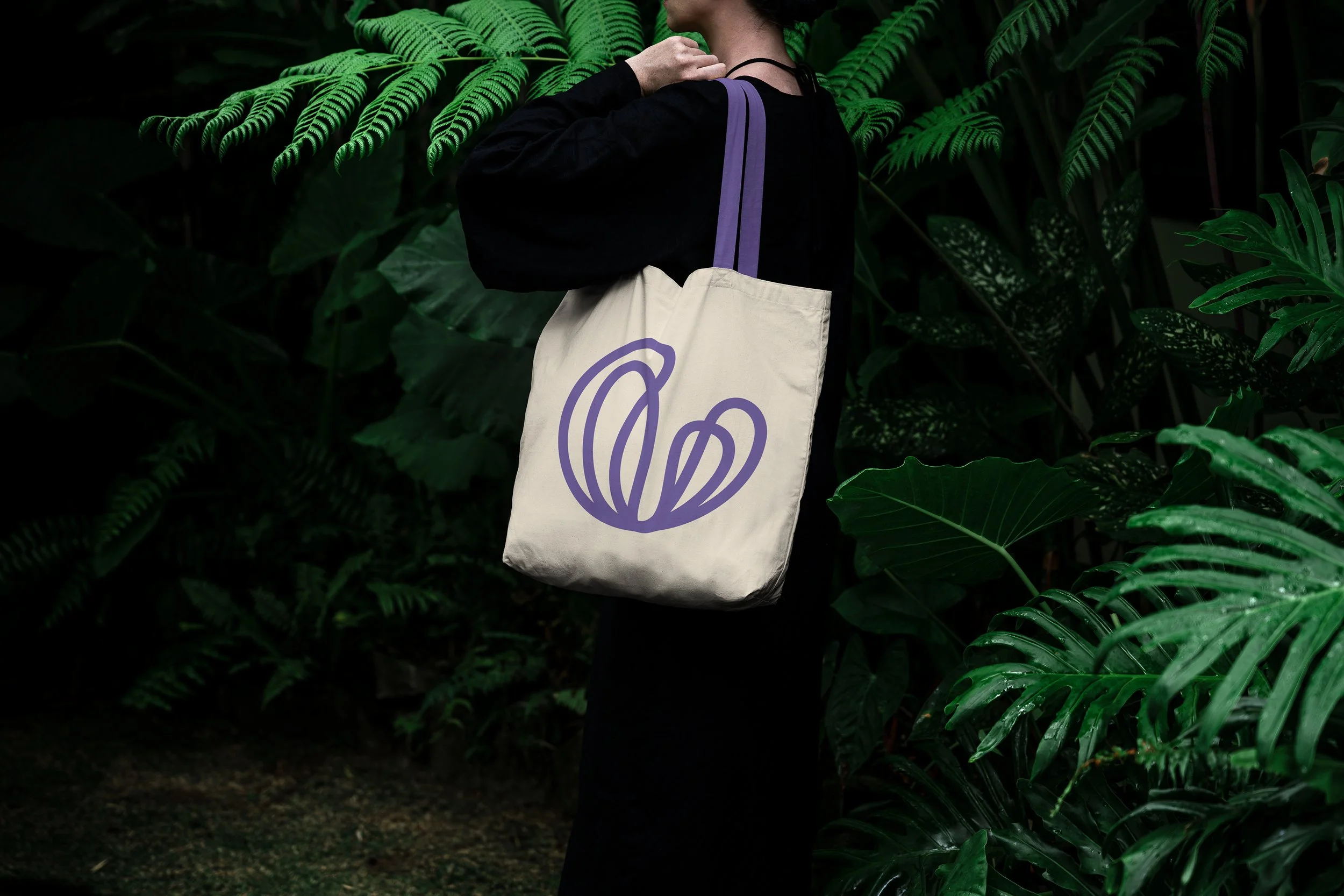
A nova marca abdica do símbolo da planta para focar-se no conceito de liberdade, o seu verdadeiro diferenciador, com linhas que sugerem movimento, crescimento e naturalidade, sem se prender a um referente concreto.
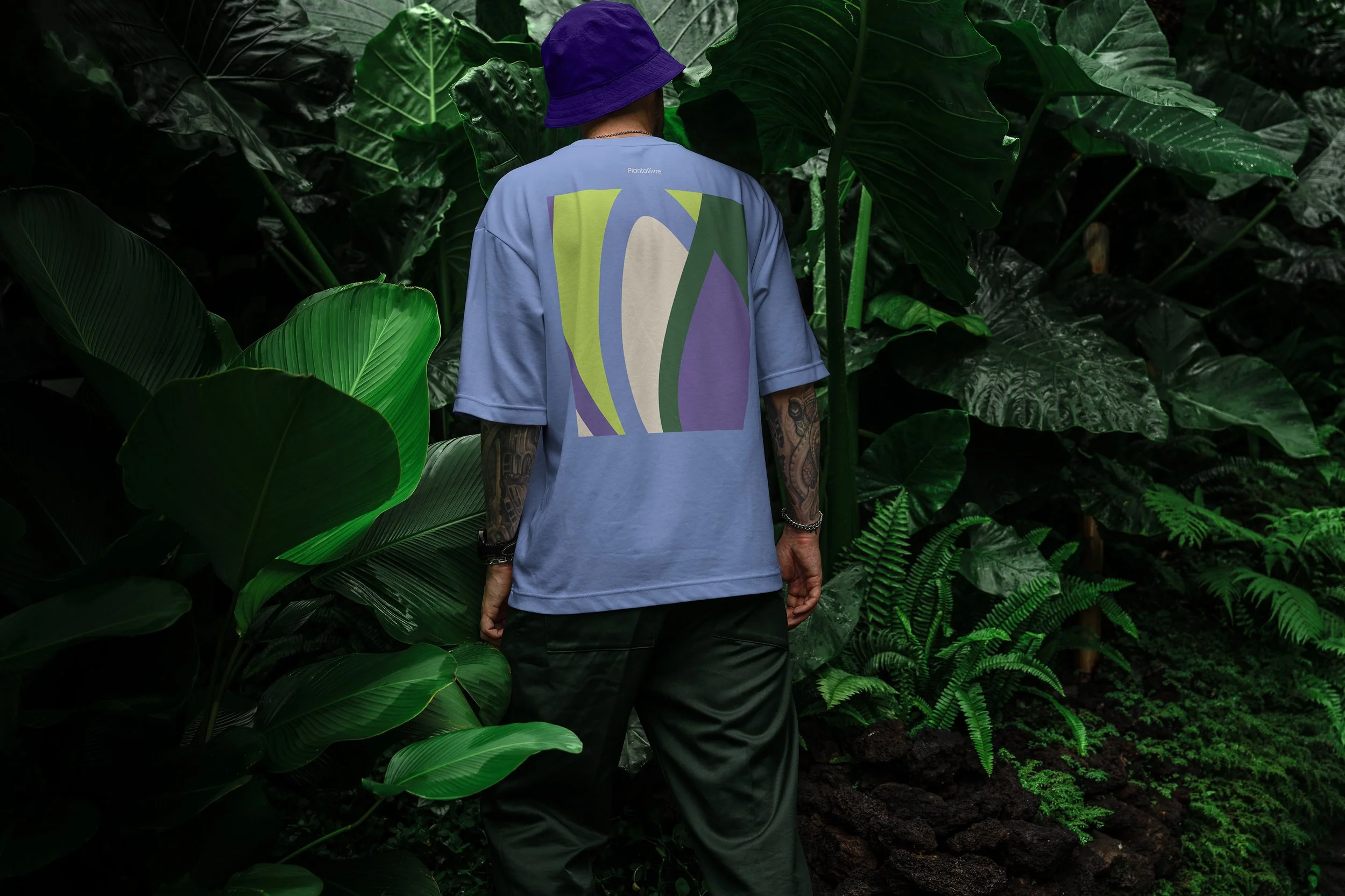
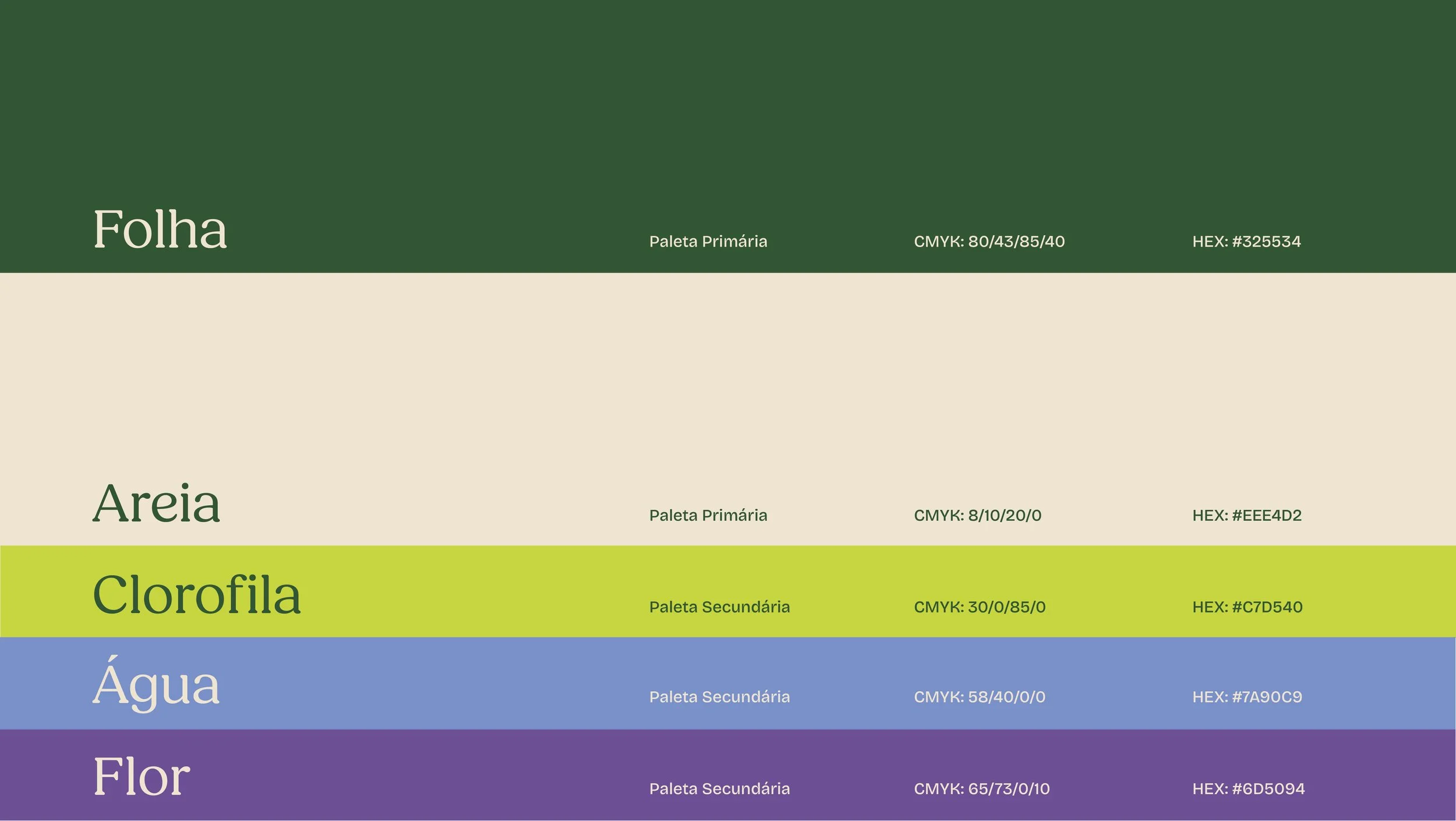
Juntamente com uma paleta cromática extensa e vibrante, a nova identidade é dinâmica e expansiva, como a natureza e a própria empresa: sabemos como nasceu, mas desconhecemos até onde crescerá.
The new brand moves away from the plant symbol to focus on the concept of freedom — its true differentiator — with lines that suggest movement, growth, and naturalness.
Paired with an extensive and vibrant color palette, the new identity is dynamic and expansive, much like nature and the company itself.
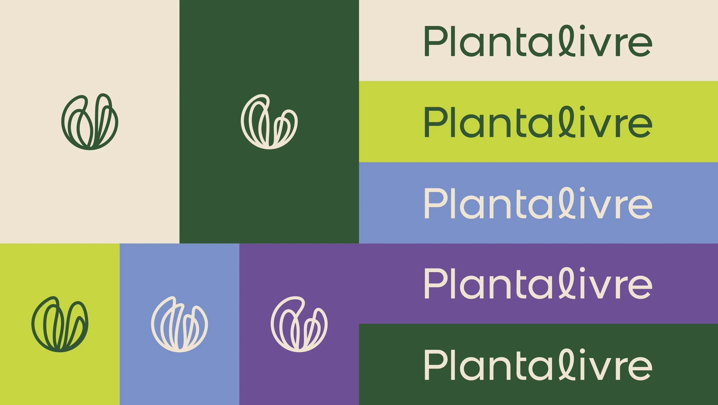


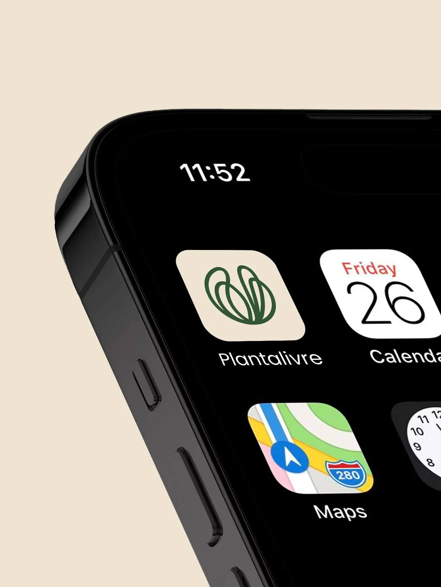
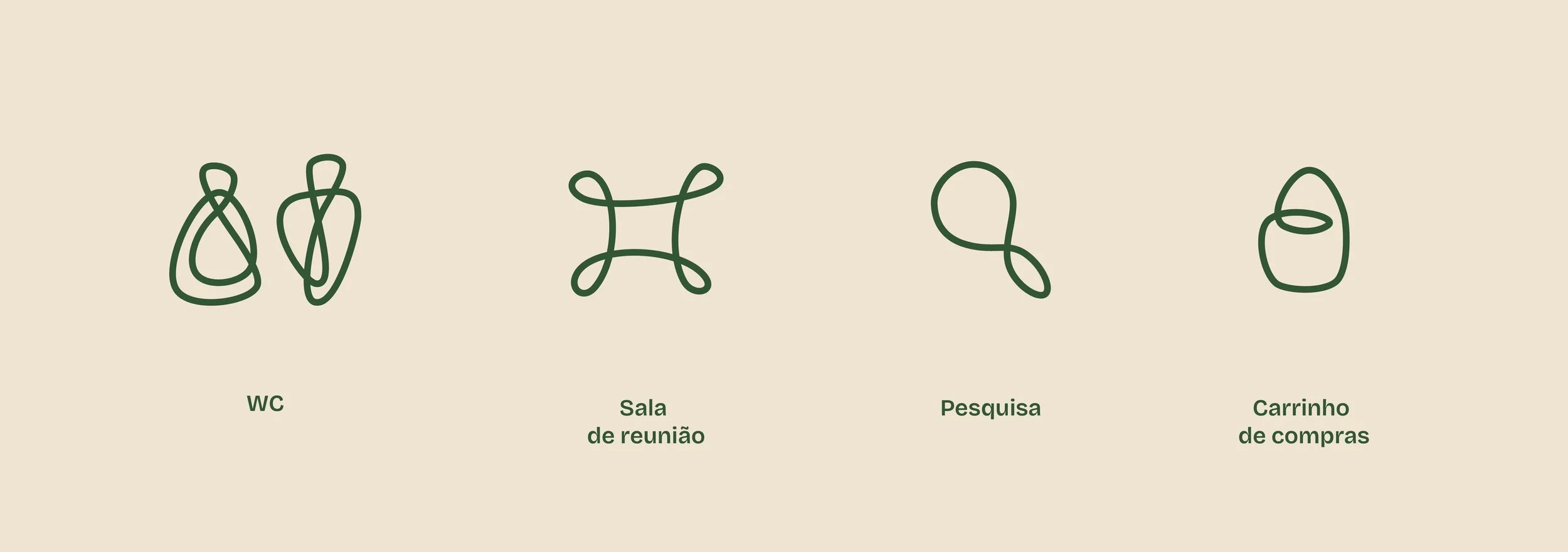
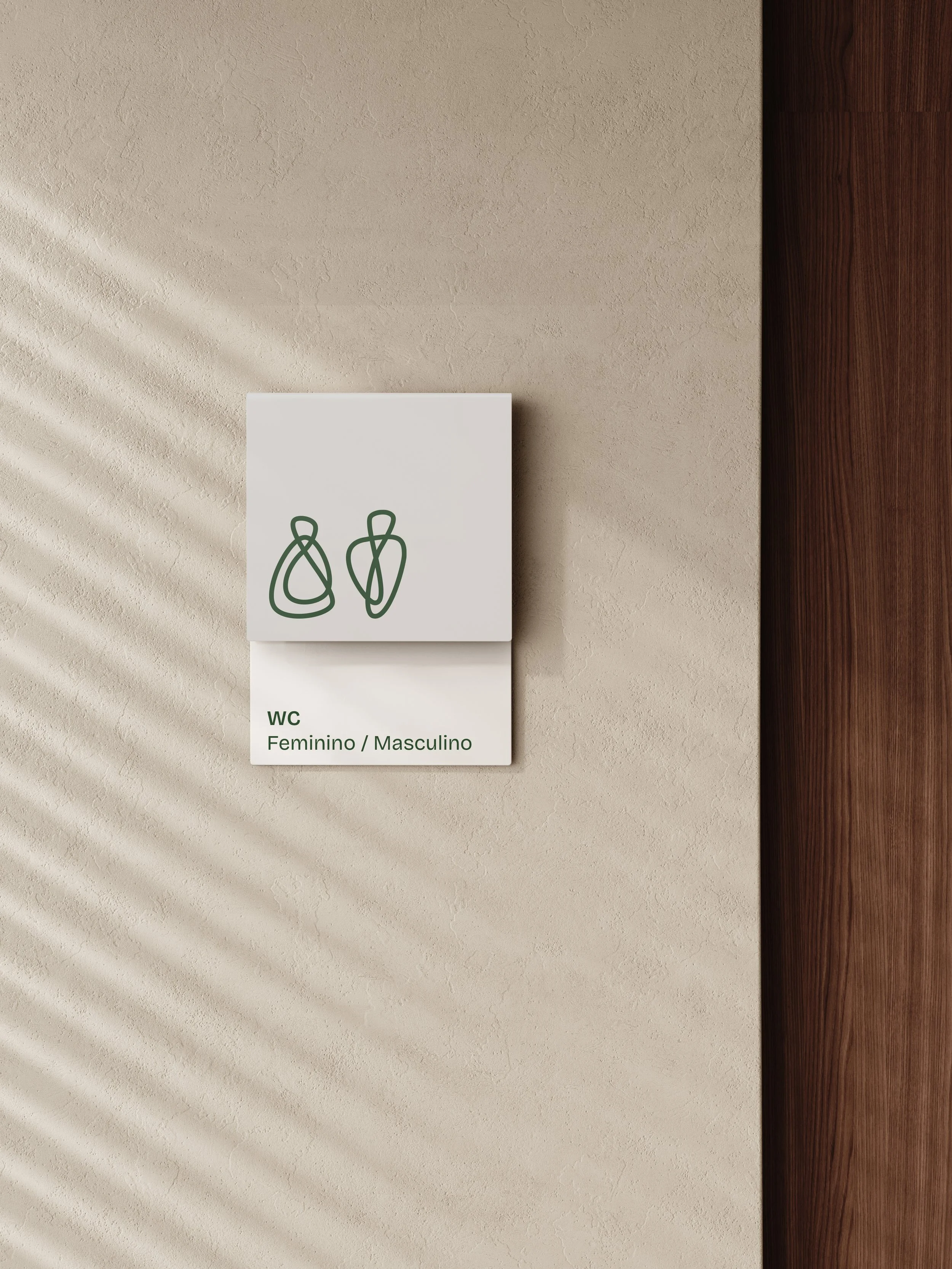
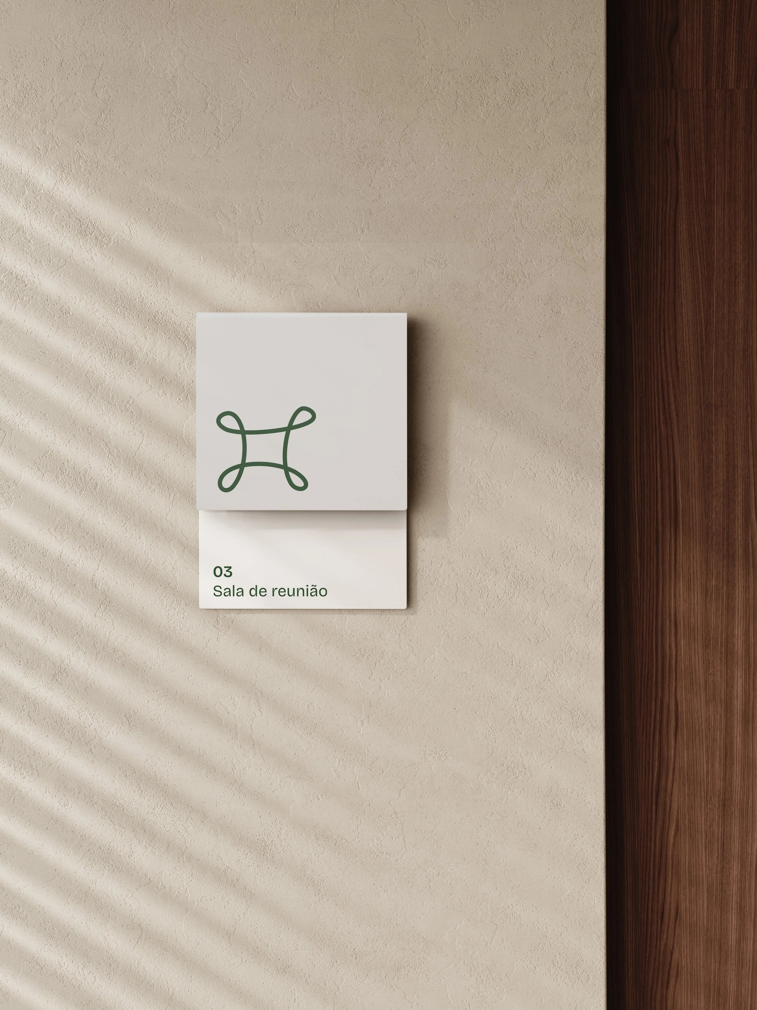
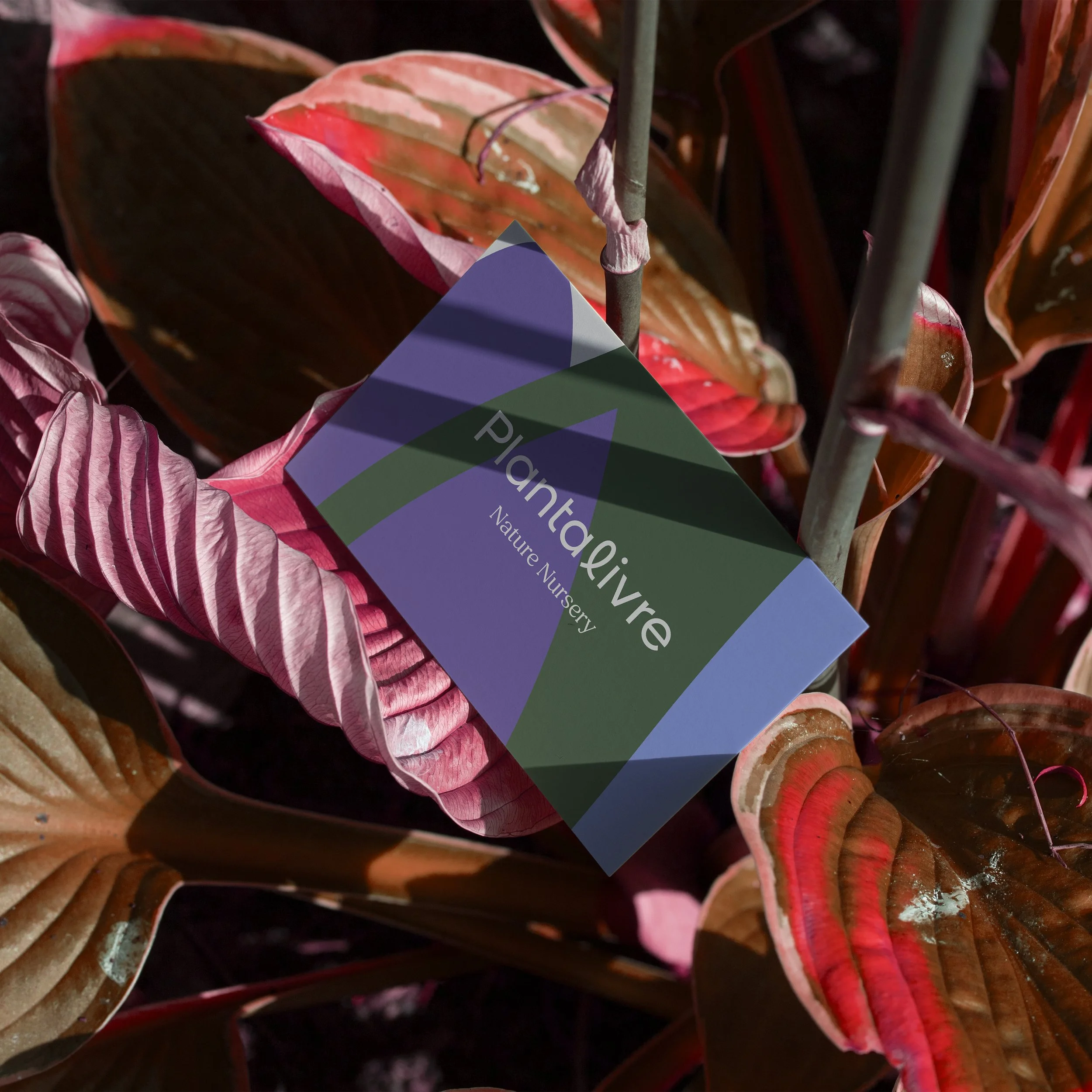
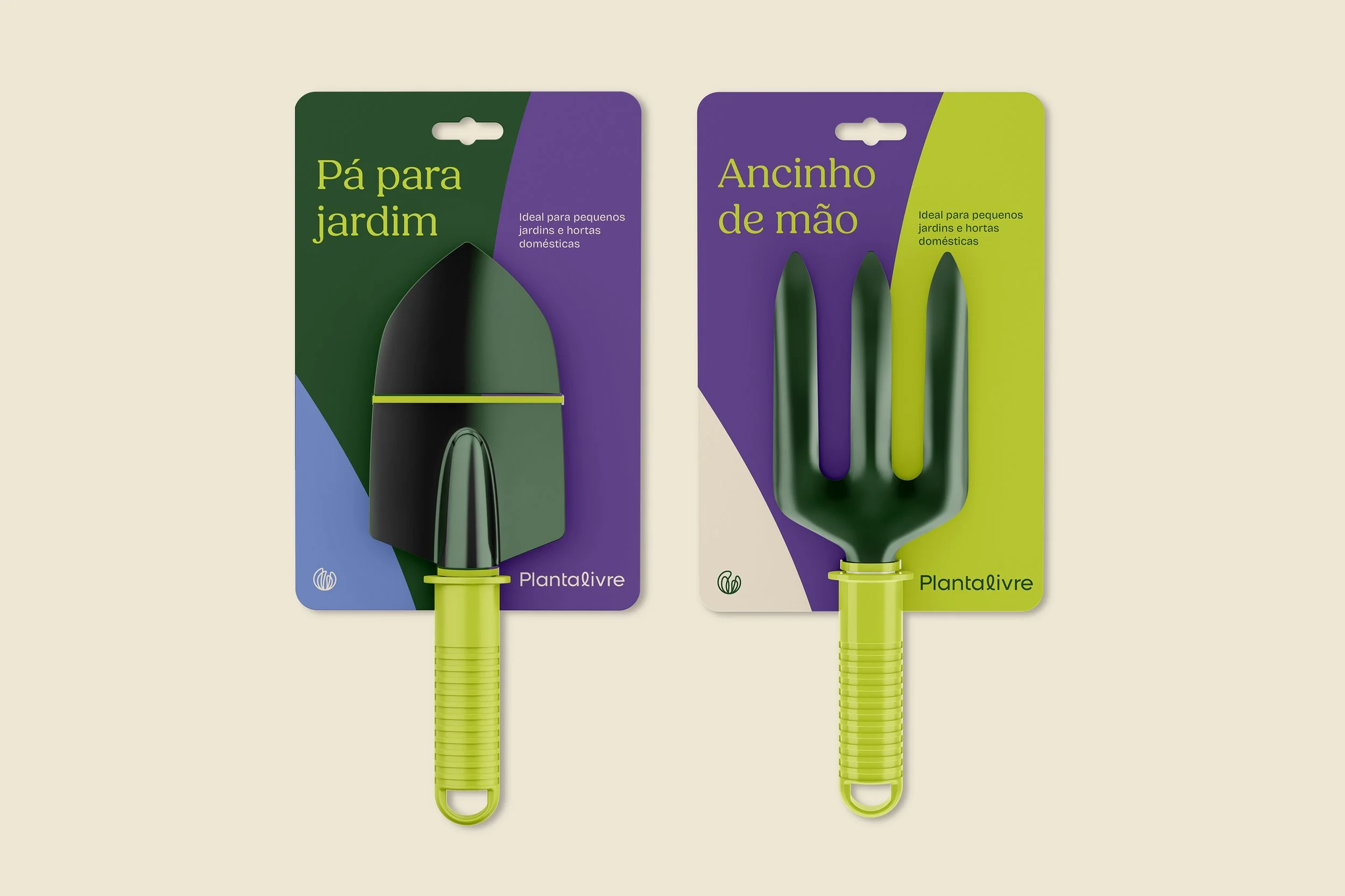
LINHA E MANCHA / STROKE AND FILL
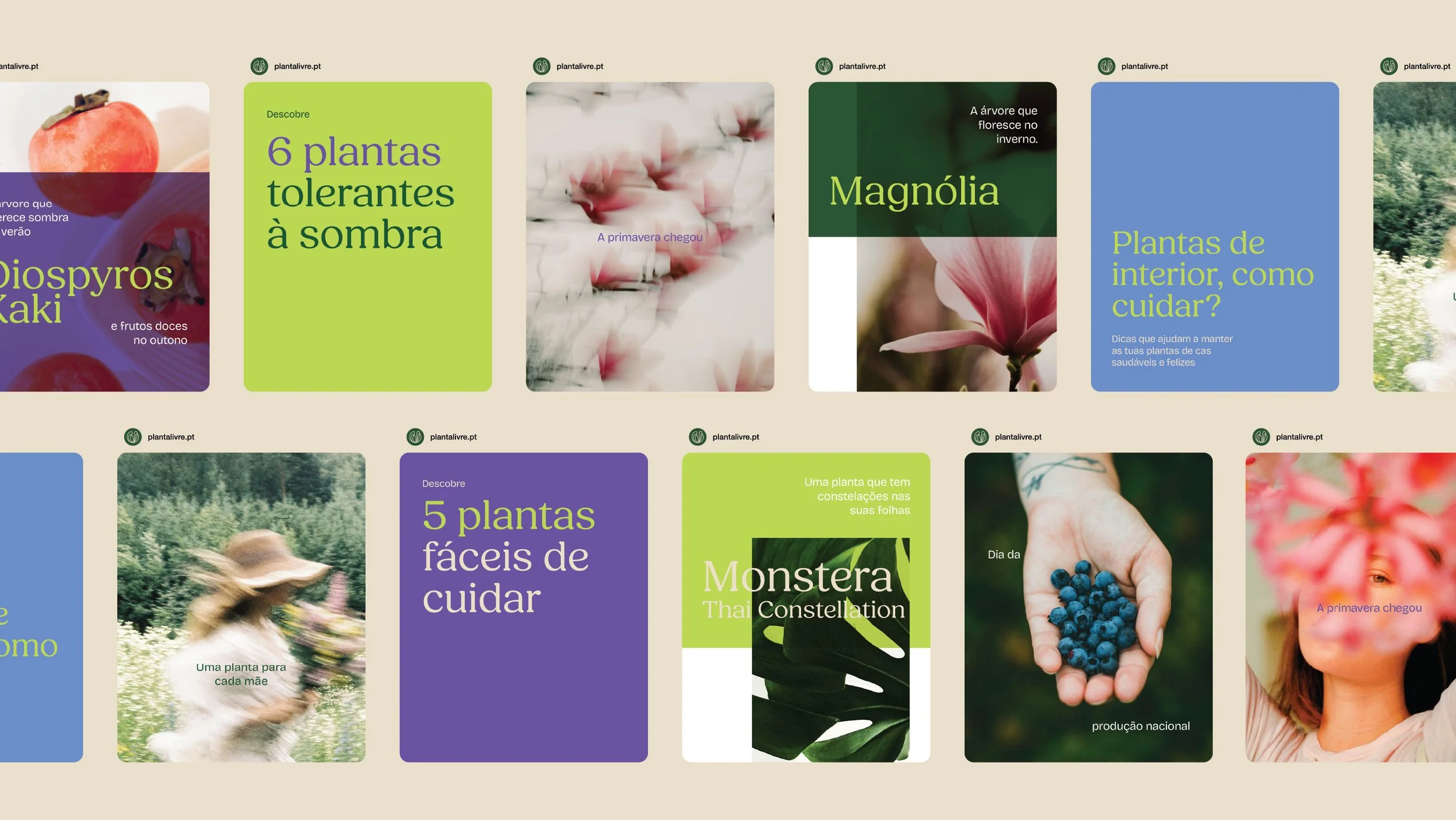
A linha do logo, dinâmica e metamórfica, abre caminho para o nascimento de uma nova família de ícones e submarcas, enquanto a paleta cromática se combina em manchas de cores vivas, abstratas, cheias de vida.
The logo’s dynamic, metamorphic line paves the way for a new family of icons and sub-brands, while the color palette combines into vivid, abstract, life-filled patches.